Tag: tools
-
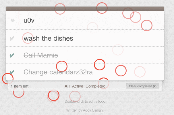
My Journey into Voice Prototyping | UX Booth
Interesting stat to the start the article: “According to Oberlo, approximately 71% of consumers even prefer to use voice searches over typing, so it goes without saying that people want to use their voices to complete actions. ” Tools such as Figma and Invision can easily simulate the functions of a “clickable” user interface but…
-
UX Design Challenges | UX Tools
Very well written and I can see this resource being used as a launch pad for any UX related project. Find a task, quickly see the pros/cons, caveats AND jump right to the methods to do them effectively and efficiently. A set of challenges to practice UX design skills. Source: UX Design Challenges | UX…
-
The Geospatial Product Trap | Sparkgeo
Loving the problem is critical because your technology will age and become obsolete. If you love the problem, you will happily change how you solve that problem to do it better. If you love the technology, you will care more about your method than the result, putting you out of alignment with your customers. Do…
-
An Overview of the Best Data Visualization Tools | Toptal
Another excellent article by Cameron Chapman. Data visualization tools provide designers with an easier way to create visual representations of large data sets. When dealing with data sets that include hundreds of thousands or millions of data points, automating the process of creating a visualization makes a designer’s job significantly easier. Source: An Overview of…
-
How courageous is your business?
Discover how your business rates on our courage scale and in aggregate data points. Source: Courage | Canada at 175
-
ColorBrewer: Color Advice for Maps
Source: ColorBrewer: Color Advice for Maps
-
Color Oracle
You can finally walk in colour-blind person’s shoes with this tool. Color Oracle is a free color blindness simulator for Window, Mac and Linux. It takes the guesswork out of designing for color blindness by showing you in real time what people with common color vision impairments will see. Source: Color Oracle
-
Skype – never again
I have family across Canada and we often like to have video chats to mainly try to chat with our growing nieces and nephews (if they can ever sit still). Skype has been our main go-to-app but after the many poor call quality experiences, security breaches, login problems going on and with the plethora of…
-
Design Mock-Ups Need Dynamic Content: Tools and Plugins – Smashing Magazine
Nothing is perfect on the web, so our mock-ups shouldn’t pretend otherwise. Some helpful tools and plugins for using dynamic content in our deliverables. Source: Design Mock-Ups Need Dynamic Content: Tools and Plugins – Smashing Magazine In practice, mock-ups usually represent a perfect experience in a perfect context with perfect data which doesn’t really exist….